on
Incumbency
Intro
Prior to each election, many publications like the Cook Political Report, Crystal Ball, and CQ politics build a partisan rating, or metric for where the district is politically aligned. The scale frequently takes the form of: Solid D/R, Likely D/R, Lean D/R, and tossup. In calculating these indices, the Cook Report specifically looks at the difference between the district’s presidential vote results to the nationwide average. (“The Cook”) Other publications use similar methodologies, adding in variables like the generic ballot and local polling.
In this blog post, I am interested in exploring Extension #1 to see how well the expert predictions fared in 2018 elections. Instead of focusing on any specific publication, I will compare the average rating across the following publications: Cook Political Report, Rotehnberg, CQ Politics, Sabato’s Crystal Ball, and Real Clear Politics.
Data
To examine the accuracy of expert predictions, I merged three main datasets: the expert predictions on competitive US House races from a variety of sources, the actual results of the elections, and the congressional maps. The average ratings were pooled from Cook, Rothenberg, CQ Politics, Sabato’s Crystal ball, and Real Clear Politics.
Extension 1
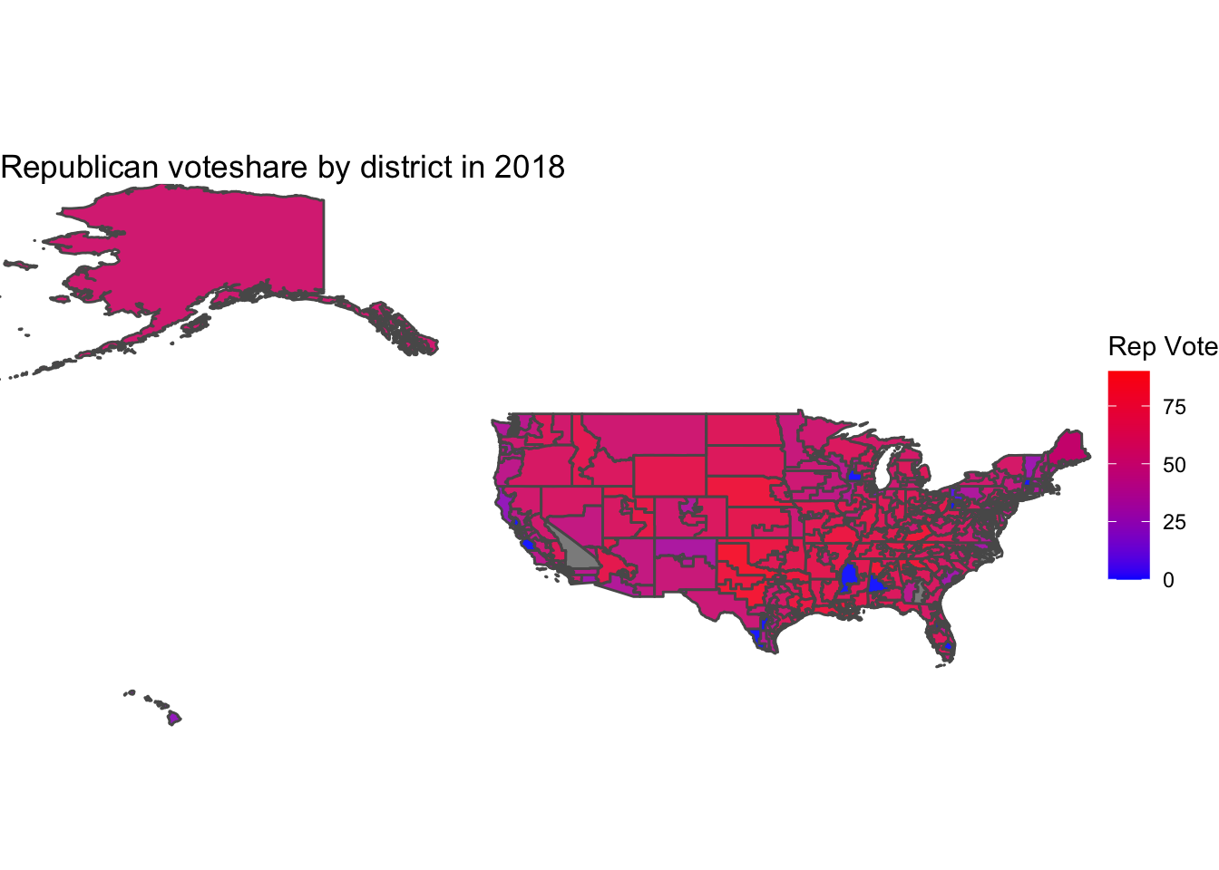
Below, I map the Republican voteshare by district in 2018, where blue values correspond to Democrat wins, red values are Republican wins, and purple values are closer margins.
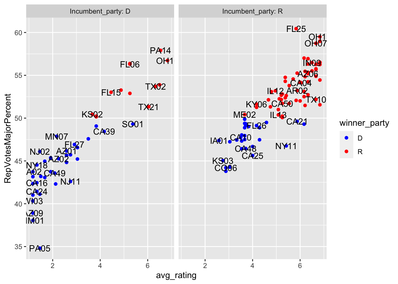
To test how well these predictions did, I looked at the acutal results below.
| Avg_rating_code | Dem_Win | Rep_Win | Dem_pct | Rep_pct | |
|---|---|---|---|---|---|
| 1 | Solid D | 13 | 0 | 1 | 1 |
| 2 | Likely D | 9 | 0 | 1 | 1 |
| 3 | Lean D | 15 | 0 | 1 | 1 |
| 4 | Toss up | 21 | 7 | 0.75 | 0.75 |
| 5 | Lean R | 3 | 23 | 0.115 | 0.115 |
| 6 | Likely R | 2 | 24 | 0.077 | 0.077 |
| 7 | Solid R | 0 | 18 | 0 | 0 |
As evident in the figure and table above, the average expert predictions fared very well in 2018, with only 5 out or 70 non-tossup races going to the other candidate.
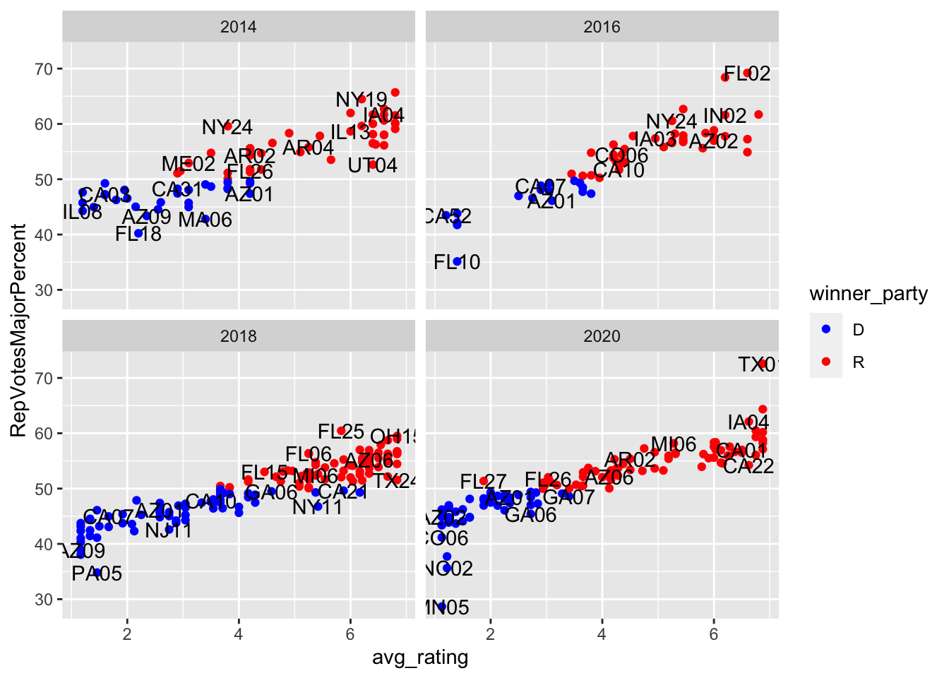
Next, I examined this from a modeling perspective, looking at data from 2014 to 2020. I chose to start at 2014 because that was the last time these specific congressional maps were in use.
##
## Results by Year
## ===================================================================
##                                   Dependent variable:
##                     -----------------------------------------------
##                                  RepVotesMajorPercent
##                            All years                 2018
##                               (1)                     (2)
## -------------------------------------------------------------------
## I(avg_rating - 4)           2.74***                 2.56***
##                             (0.09)                  (0.10)
##
## Constant                   50.99***                48.96***
##                             (0.16)                  (0.19)
##
## -------------------------------------------------------------------
## Observations                  381                     135
## R2                           0.71                    0.82
## Adjusted R2                  0.71                    0.82
## Residual Std. Error     3.11 (df = 379)         2.12 (df = 133)
## F Statistic         936.63*** (df = 1; 379) 611.78*** (df = 1; 133)
## ===================================================================
## Note:                                   *p<0.1; **p<0.05; ***p<0.01
##
## Results by Incumbent Party
## ===================================================================
## Dependent variable:
## -----------------------------------------------
## RepVotesMajorPercent
## R Incumbent D Incumbent
## (1) (2)
## -------------------------------------------------------------------
## I(avg_rating - 4) 2.93*** 2.96***
## (0.19) (0.14)
##
## Constant 50.35*** 51.54***
## (0.34) (0.25)
##
## -------------------------------------------------------------------
## Observations 182 199
## R2 0.56 0.71
## Adjusted R2 0.56 0.71
## Residual Std. Error 3.11 (df = 180) 3.07 (df = 197)
## F Statistic 230.05*** (df = 1; 180) 474.35*** (df = 1; 197)
## ===================================================================
## Note: *p<0.1; **p<0.05; ***p<0.01As this regression output table shows, the model had the highest R^2 in 2018, followed by times where the Incumbent was Democrat or the entire dataset, followed by the times the incumbent was republican. I chose to center average rating around 0, such that I could interpret the results more directionally. In each model, any movement above tossup towards Republican is associated with about a 2-3 percentage points higher Republican vote margin. Moving forward, I think it would be useful to play around with transformations, like polynomials and logs to better account for the non-linear trends after centering.
Next, I look at how well this model would’ve performed on 2022 data had we excluded it from my model.
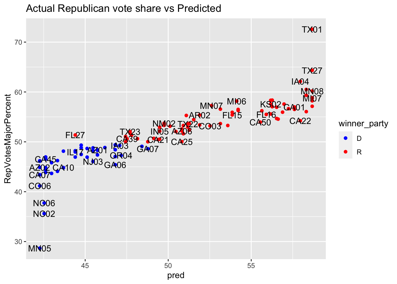 As this graph shows, there was only one case where the model predicted a margin
difference of greater than .5 and the election went the other way. Hence,
this model provided strong accuracy in 2020, but since this is only one year,
further cross validation would be necessary to truly test the model.
As this graph shows, there was only one case where the model predicted a margin
difference of greater than .5 and the election went the other way. Hence,
this model provided strong accuracy in 2020, but since this is only one year,
further cross validation would be necessary to truly test the model.
Forecast Update
For this week’s update, I return to my district: OH-01, using Kiara’s helpful section code.
##        fit      lwr      upr
## 1 52.72655 51.30364 54.14946
## fit lwr upr
## 1 53.71 53.71 53.71Here, I calculated two prediction margins: one modeled based on polling and one based on polling and the Cook rating. In each case, I predict that Chabot will win with a small margin. However, my model including the Cook rating does not seem sound because it has so few data points to work through, so it doesn’t have enough fit details to run an interval. Therefore, in the upcoming weeks, I will work on including more data (through Chabot’s whole term dating back to the 1990’s) to better model these two variables.
References
“The Cook Political Report’s Partisan Voter Index.” Ballotpedia, https://ballotpedia.org/The_Cook_Political_Report%27s_Partisan_Voter_Index.