on
Blog Post #1 - Introduction
Intro
Hello! My name is Ellie Grueskin, and I am a senior at Harvard College studying Economics. I will be logging my work in Government 1347: Election Analytics, taught by Ryan Enos, throughout the semester. In this introductory post, I analyze the popular vote shares in US House races over the last 70 years. At the end, I will also begin exploring my specific house race: Ohio-01.
Data
My dataset is a collection of the vote data for each house election, dating back to 1948. Each observation contains the congressional district’s name, state, candidates, and respective votes for each election. As well, it gives information as to whether the candidate was an incumbent or challenger. In this analysis, I reformat the data to exclude independent and write-in candidates, such that the ‘vote share’ margin is calculated as the number of Democratic or Republican votes divided by the sum of their votes.
Results - Swing States over Time
In my first plot, I examine the four-year change in share of a state’s housewide popular votes that went to Republicans. I start with 1952 because the dataset only started in 1948. To clarify, a Republican vote margin above 50% means that Republicans received the majority of the popular vote in the state during that year. This does not necessarily translate to house seats, as districts are not divided evenly across state’s party divisions.
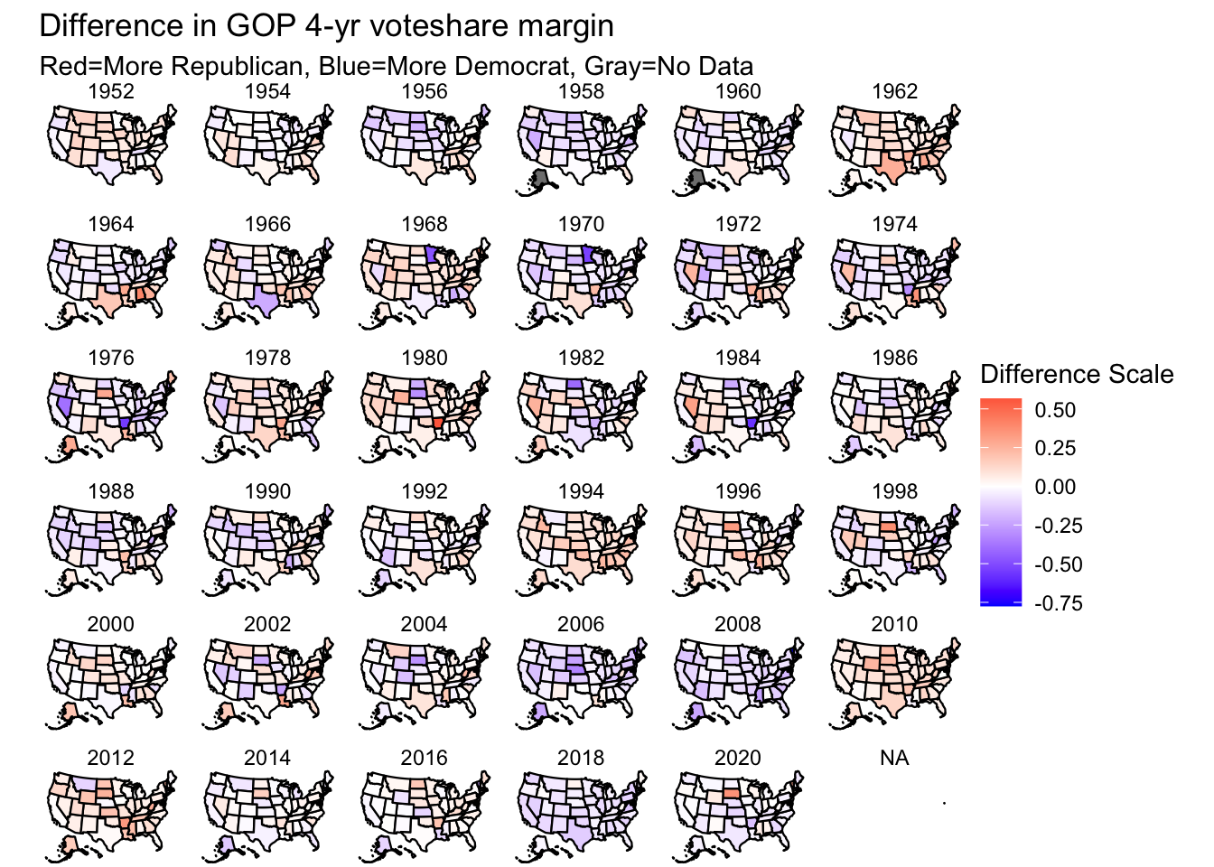
As this map shows, there can be substantial variation in state-wide House popular vote share over years. Most of the largest variations (or darkest colors) occur in the lower-populated states with fewer representatives, particularly when at least one race is uncontested.
The two states that seemed to have lost their battleground status are Missouri and Colorado, with the former turning more red and the latter turning more blue. On the other hand, states slightly north like Michigan, Wisconsin, Pennsylvania, and Minnesota appear to have stayed as battleground states in spite of demographic and polarization changes.
Next, I plotted the two year differences by state because our interest this year is in predicting a midterm year. In this section, I only used maps from 1950 because 1948 was the first year in this dataset.
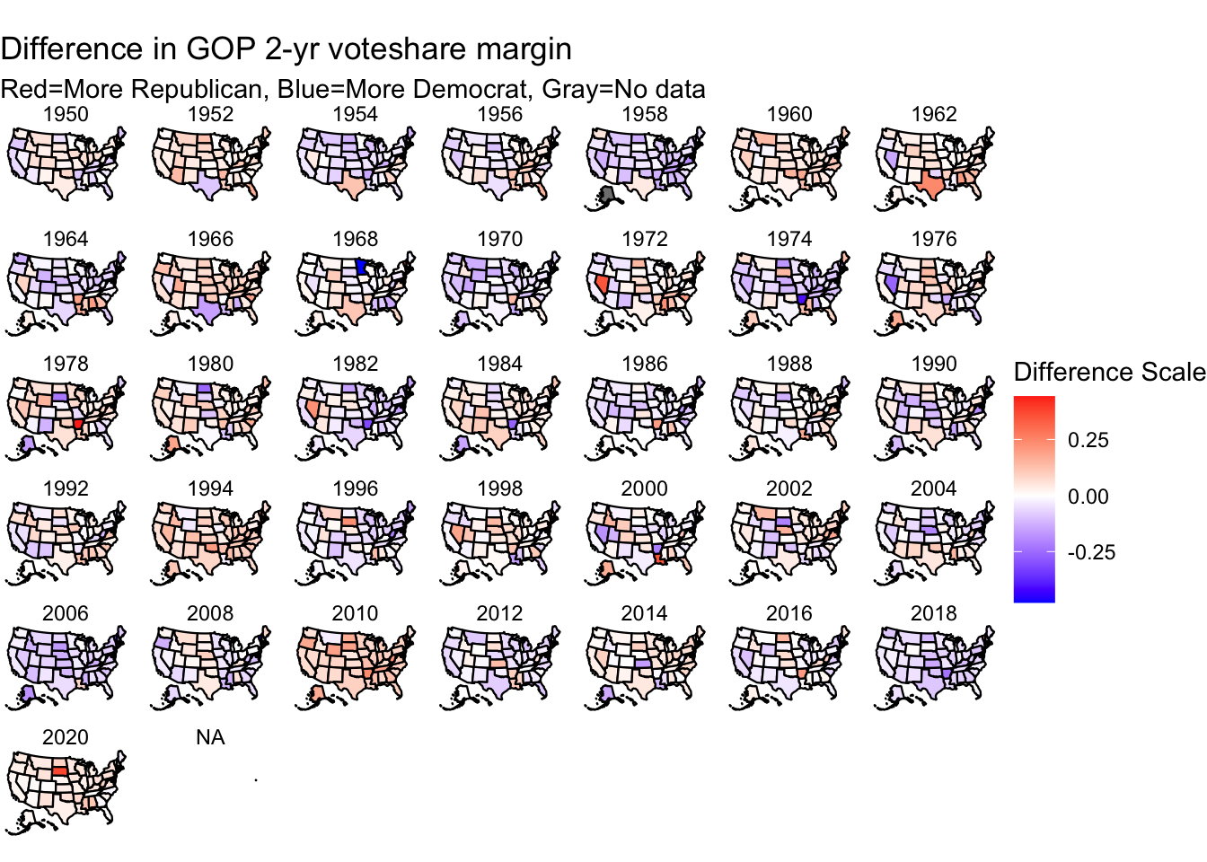
Similar to the earlier plot, the figure above shows that Democrats are losing some of the Midwestern states while picking up some of the Southeast and Southwest. Many of these states would still be considered battleground, but if patterns persist, it’s likely that they would move to the ‘lean/solid’ category.
I found it particularly interesting how a few recent midterm elections - 1994, 2010, 2014, and 2018- were associated with significant declines in the incumbent’s party’s overall popular vote in house races by state. Similarly, I thought it was noteworthy that the overall range in differences was much smaller for this plot. I believe this illustrates how an incumbent can often become popular after their first term, and therefore capture even more of their vote in subsequent elections.
Results-Ohio
Finally, I zoomed into trends in the Ohio District 1, the specific congressional district I’ll be following.
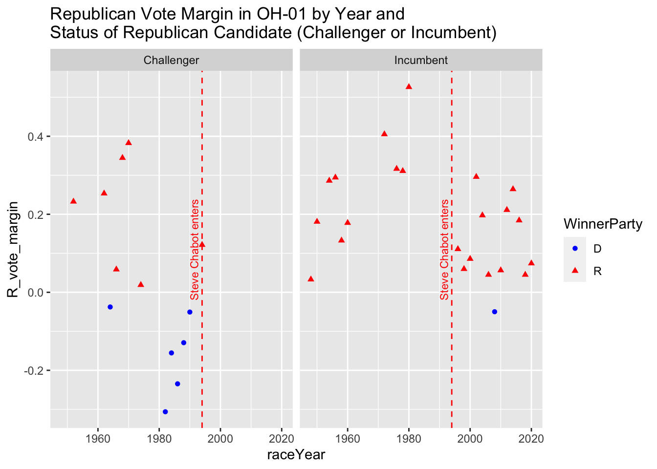
Through these plots, I pay particular attention to voting pattern since the incumbent, Steve Chabot, took office. As you can see, the district has been red the majority of the time, with incumbent Republicans doing especially well.
Steve Chabot first took office in 1994 and has been reelected every year but 2008. This could’ve been because of the Great Recession and overall discontent with the Republican party. While Chabot’s popularity was rising throughout the mid 2010’s, it appears to have taken a hit with his winning margin only around .05 throughout the last 4 years. Another noteworthy element: I removed the data from 1992 where a Democrat (David Mann) ran uncontested and won because it was enlarging the y-axis too much. Mann ended up losing to Steve Chabot in 1994 by a sizable margin of 0.1.
Conclusion
In this first blog post, I analyzed differences in state-wide house voting by two and four year intervals. While many battleground states remain in place like Florida, Michigan, Wisconsin, some of the other states in the Midwest and Southwest appear to be leaning more one party than earlier.
As mentioned earlier, the popular vote does not carry a 1:1 relationship with seat share, so this blog is more exploring trends than asserting exact ramifications.
I look forward to updating this blog and diving deeper into the Ohio-01 district race.